

The job of a TV meteorologist doesn’t end when the lights and cameras turn off in the studio. As a part of our contract, we represent the station in the community in various ways. We regularly emcee events, play the role of auctioneer, participate in charity functions, and make appearances at events for our community partners. It’s a great way for those of us on TV to meet people, give back, and help promote our station.
One of my favorite ways to contribute outside of the newscasts is visiting local elementary schools. In the past ten years at KPTV, I’ve visited over 160 classrooms (about 15-20 a year) to teach kids about the weather. From kindergartners to high schoolers, I’ve found that most kids are fascinated by the weather and want to learn about the science behind it.
Since the school year just started at our Portland area schools, I decided to create a graphic to use on my blog and other websites to promote our “Weather in Schools” program. Parents and teachers are the primary audiences for this composition. The setting for the graphic is the front of a classroom.
First, I wanted to add texture to the back wall in the image. I used the bevel & emboss feature and added a texture that would look less flat and more like a painted wall. I ran into the problem of the bevel coming through on the sides, so I made the layer slightly larger to hide that.
I made sure there was a call to action, to encourage people to check out our website and sign up. I chose the typeface at the top and bottom of the graphic because it had a playful chalk look, but I didn’t like it for the main chalkboard font, because some of the letters were hard to read (particularly the lowercase “t”). For that, I had to create my own chalk look. First, I rasterized the font so I could manipulate it. Then, I added a noise filter. This broke up the letters a bit. I used 150% for the amount and made the distribution Gaussian so the dark parts would be more random. I also dropped the opacity of the text, down to 90% so it wasn’t too bright and looked more realistic.
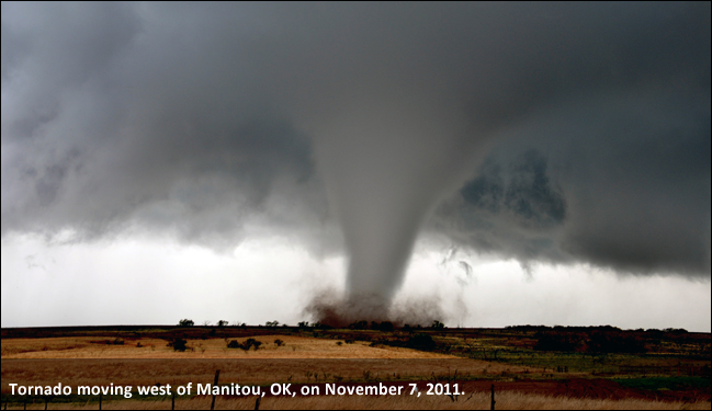
I wanted to use dramatic photos, because during my talks, I focus on some of the more intense kinds of weather events. I decided to use pins to give it a bulletin board kind of look next to the chalkboard. Each photo has a drop shadow at 120°. I adjusted the hue and saturation of all three photos to give different looks. The chalkboard also has a 120° drop shadow.
In my first draft, I thought it would be fun to implement the chalk look to my headshot as well. However, my classmate Justin made a good suggestion during the peer review process of this project. He said the “chalk drawn” photo was a little distracting because it was too distorted and it might not be worth using this effect. He offered the suggestion of “taping” the photo to the blackboard instead. I made tape out of a couple of lines and set a low opacity. I then gave the ends of the tape a jagged edge using the eraser tool. This gave it a much cleaner look.
Also in my first draft, I had the text on the bottom more right aligned, but after Justin’s feedback and stepping back from the project for a couple of days, I decided to center the words at the bottom to give it a better flow.
I made sure to use photos that adhere to copyright law. The hurricane satellite photo is from the National Hurricane Center and the tornado photo is from the National Weather Service’s Chris Spannagle. Works produced by the United States government are not copyrightable. The lightning photo, pins (red & blue), and chalkboard use a license from Pixabay, which can be used freely for commercial or noncommercial use. I took the photo of Mt. Hood and the headshot photo.
This project was valuable for learning about some of the basics of Photoshop. It’s a very powerful program and I’m anxious to watch more tutorials, because I am just scratching the surface of what it can do.
