
The job of a TV meteorologist doesn’t end when the lights and cameras turn off in the studio. As a part of our contract, we represent the station in the community in various ways. We regularly emcee events, play the role of auctioneer, participate in charity functions, and make appearances at events for our community partners. It’s a great way for those of us on TV to meet people, give back, and help promote our station.
One of my favorite ways to contribute outside of the newscasts is visiting local elementary schools. In the past ten years at KPTV, I’ve visited over 160 classrooms (about 15-20 a year) to teach kids about the weather. From kindergarteners to high schoolers, I’ve found that most kids are fascinated by the weather and want to learn about the science behind it.
Since the school year just started at our Portland area schools, I decided to create a graphic to use on my blog and other websites to promote our “Weather in Schools” program. Parents and teachers are the primary audiences for this composition.
I made sure there was a call to action, to encourage people to check out our website and sign up. I chose the typeface at the top and bottom of the graphic because it had a playful chalk look, but I didn’t like it for the main chalkboard font, because some of the letters were hard to read (particularly the lowercase “t”). For that, I had to create my own chalk look. More on that later.
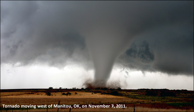
The hurricane satellite photo is from the National Hurricane Center and the tornado photo is from the National Weather Service’s Chris Spannagle. Works produced by the United States government are not copyrightable. The lightning photo, pins (red & blue), and chalkboard use a license from Pixabay, which can be used freely for commercial or noncommercial use. I took the photo of Mt. Hood and the headshot photo.
I wanted to use dramatic photos, because during my talks, I focus on some of the more intense kinds of weather events. I decided to use pins to give it a bulletin board kind of look next to the chalkboard. Each photo has a drop shadow at 120°. I adjusted the hue and saturation of all three photos to give different looks. The chalkboard also has a 120° drop shadow.
I also wanted to create a “chalk look” to my headshot and the writing on the chalkboard. For the words, I used the text button to create the words and position them. Then, I rasterized the font so I could manipulate it. Then, I added a noise filter and lowered the opacity on the noise to give it a broken up chalk look.
For the photo, I used the artistic filter and settled on the chalk/charcoal setting and made sure it was monochrome. I tinkered with the adjustments so that you could still tell it was my face. Then, I used the smudge tool on the sides to give it less of a perfect box photo feel. Finally, I added a noise filter to break it up and give it the look as if it was drawn with chalk. I decreased the opacity of the noise to about 70%.
I chose to offset my text to read from the top left to bottom right. The eye naturally goes this way when reading and I think it flows nicely.
I am looking forward to the review process of this project to improve the final design.

Great job on your graphic design project! I’ll start with what I like most about the design. I think the strongest aspect is the unity of theme and design. There is absolutely no question who your target audience is. You have clearly identified that this is program for students and tailored the theme to fit accordingly. You did an excellent job of incorporating subtle elements of the classroom theme, such as the pushpins and the “chalk” typeface. I think it all ties together very well and presents both visual and intellectual unity.
As far as possible areas of improvement, I feel like there is a lot of empty blue space under the chalkboard and to the left of “Details at KPTV.com.” I wonder if there is a way to use that space, by either centering the text or repositioning the text from the top of the image (“Sign up your class today!”) to create a more balanced composition.
In looking at the profile photo on the chalkboard, I like that you are continuing the chalk theme throughout. However, in practical application, I feel that the effect distorts the image in a way that is slightly distracting from the overall feel of the piece. One suggestion might be to treat the photo like the other weather-related images, as if it were a physical photograph affixed to the board (maybe with a piece of “tape” at the top).
Overall, great work!
LikeLike
It’s always nice to take a break from a project for a day or two and look at it again with fresh eyes. Overall, I’m happy with how this turned out and now I have some new ideas on how to make it better.
Justin offered up some great suggestions to help improve this design. The flow of it bothered me when I created the draft. Justin said there was too much blank space at the bottom and he’s right. I will try centering the text at the bottom to see if that looks better. I also considered filling that space with some other classroom decor and leaving the text where it is, but I don’t want to make it too busy.
Justin’s other suggestion was in regards to the “chalk drawn” photo, which he found a little distracting because the image is perhaps too distorted. It’s tough to give it that chalk drawn feel without distorting the image, so it might not be worth it to use this effect. I will try his suggestion of “taping” the photo to the blackboard instead to see how that looks. I also will try tweaking the noise on the current effect to see if it looks any better.
I have some texture on the wall, but in the final draft, I will likely make that texture a little more prominent.
Thanks for the suggestions!
LikeLike